

Country Set; Women's Fashion Trend
This Womenswear trend is inspired by the English countryside….
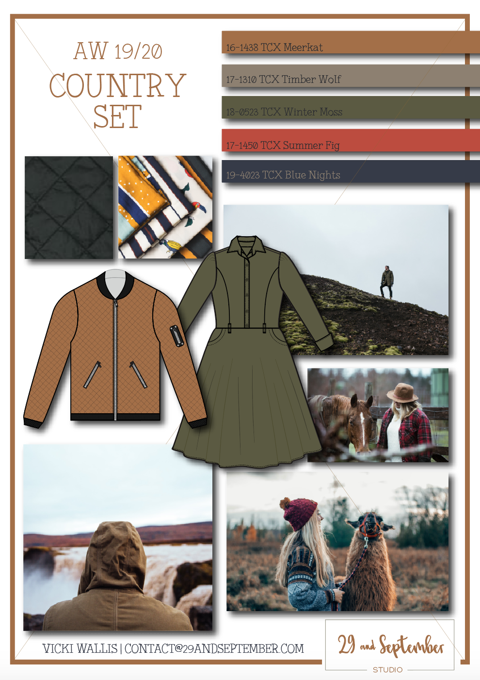
'Country Set' is very much an English term (I think!) and refers to a group of people who live in the countryside and have a certain style about them. Think Hunter Wellingtons (gum boots!), Kate Middleton in her Norfolk home, Country estates and super-cute spaniels. In terms of fashion, for this Autumn/Winter we're seeing this look moving into the city too.
A key item for this trend is a parka or anorak, usually in a green shade and worn with a patterned jumper or shirt dress. Equestrian styling is also used, particularly in the trousers (slim fit and high waisted with piped pockets) and also prints; there's lots of Gucci style chain prints around for this season.
The bomber jacket is back with an update; heavy quilting and embroidered logos feature on new season styles. There's even the addition of a hood in some cases too.
In terms of prints, checks feature here alongside the chain references and also a lot of scarf prints, where multiple styles are used within one design. For the scarf prints, keep the colour palette the same and play with motifs and scale, to avoid too much overload.
I really hope you like this trend! I live in the countryside and see this look all the time (and yes, I do have a spaniel!), so it's exciting to see it coming into the mainstream. What do you think of this look?

I hope you like this trend as much as I do and feel inspired to create your collection! If you're looking for trend information, or design ideas but don't know where to start, I'd love to work with you on this and have limited spaces for working with clients 1-on-1. You can see the full range of services I provide here, or you can get in touch for more info, here.

I hate spam too - if you sign up to this email list, your details won't be sold or leased to anyone else. I will email you from time to time with helpful content and occasional offers, which you can unsubscribe from at any time.


SS19 Women's Trend Board; Nu Botanicals
This moodboard is a little different to the others I’ve shared so far, it’s more abstract and closer to those used by high end designers.

This trend board is a little bit different than some of the previous ones I’ve shared, as it's more artistic in style and very much open to interpretation. I know a lot of you reading are new to the industry and may not know that this type of board is often what high end designers use - they start their creative direction by looking at something completely unrelated to fashion. It helps them to push themselves to be more creative and avoid referencing other designers. By working this way, a brand can create their own signature look, rather than being influenced by everyone else.
Personally, I love this way of working and it's definitely how I prefer to work, but most commercial brands reference other designers and create moodboards similar to the ones I've shown previously. If you're interested in learning more about how brands work, there's a whole module on design in my Fashion Startup Online Course. You can read more about that by clicking here.
This trend is about botanics and mixes microscopic cell references with vintage style botanical illustrations. I love this mix and find it so inspiring - it gives so many options for design and I love the idea of mixing different fabrics and textures. For example, super light chiffons, glossy silk satins mixed with heavy beading and sequin details. Pleats, ruffles and folds too.


Because of all the detail, I think this would suit high end Women's clothing best. I think to do this well you need to have some luxury in the fabrics and finish.
I'd love to know what you guys think of this trend and how you would use it. I'm excited to share my take on it with you soon as well.
As always, I'm keen to hear your ideas for trends or products that you'd like to see ideas for in the future.
Working Further Ahead?
Many brands I'm working with are already developing their collections for SS2020 and AW 20/21. If you've already finished 2019 and want more insight on future trends, or want to know how to interpret trends for your own brand and customer, I'd love to work with you on this. I have limited spaces for working with clients 1-on-1. You can see the full range of services I provide here, or you can get in touch for more info, here.

I hate spam too - if you sign up to this email list, your details won't be sold or leased to anyone else. I will email you from time to time with helpful content and occasional offers, which you can unsubscribe from at any time.

Ocean Depths SS19 Trend Board
This is the last swimwear look I’m sharing for SS19. It takes inspiration from activewear and surfing, so think mesh, chunky zips and elastics….

This is the last SS19 swimwear trend I’ll be sharing. It takes inspiration from activewear and performance based products like wetsuits, so think about mesh trims, chunky zips, elastics and sporty styling. The colour palette features commercial blue tones and a pop of bright red, which I love to include in a striped elastic - great for hem bands and straps.
I think this trend is really commercial and could work with any area of the market. I think it could be especially strong in young fashion, but can be tailored to suit anyone.
For this look I think plain block colours and/or stripes work best, rather than any prints. Do be careful if you’re using the white to make sure that your fabric doesn’t become see through when wet! A common problem I see all too often at the lower end of the market!


Working Further Ahead?
Many brands I'm working with are already developing their collections for A/W 19/20 and SS2020. If you've already finished SS19 and want more insight on future trends, I'd love to work with you on this. If you're looking for trend information, or design ideas but don't know where to start, I have limited spaces for working with clients 1-on-1. You can see the full range of services I provide here, or you can get in touch for more info, here.

I hate spam too - if you sign up to this email list, your details won't be sold or leased to anyone else. I will email you from time to time with helpful content and occasional offers, which you can unsubscribe from at any time.
Pared Back Prairie SS19 Trend Board
This SS19 Womenswear trend features a neutral colour palette with a pop of burnt red….

I was really torn between this colour palette and a much brighter one, so I asked my Instagram followers for their opinion. About 75% went for this one, so we had a clear winner! If you're not already following along on Instagram, you can join us by clicking here - I regularly ask followers for their opinion on what they’d like to see next.
I shared this look with my subscribers about a month ago, it’s for Womenswear brands and I’ve called it ‘Pared Back Prairie’. The colour palette is much more muted than what we've seen in previous seasons, with just a slight pop of 'Tigerlily' burnt red. The key features of the Prairie look are still going strong - think shirred waists, big sleeves and hand crafted embellishments, but all in a much more subtle way. You'll see a lot of solid colour in use, vs the paisley style prints we've seen in past years. There is still some use of print, either subtle florals or print versions of craft techniques like embroidery, weaving and cross stitch.
In terms of fabrics, there's a lot of natural fibres being used here, like linen, organic cotton and drapey bamboo. Many are smooth to the touch, but don't rule out textured weaves and slub finishes.


Working Further Ahead?
Many brands I'm working with are already developing their collections for A/W 19/20 and SS2020. If you've already finished SS19 and want more insight on future trends, I'd love to work with you on this. If you're looking for trend information, or design ideas but don't know where to start, I have limited spaces for working with clients 1-on-1. You can see the full range of services I provide here, or you can get in touch for more info, here.

I hate spam too - if you sign up to this email list, your details won't be sold or leased to anyone else. I will email you from time to time with helpful content and occasional offers, which you can unsubscribe from at any time.
Bohemian Mix SS19 Trend
This SS19 Womenswear trend features mixed floral prints, a bold colour scheme and silhouettes with volume….

This trend seemed like a great one to create in the dull Winter months - something bright to get us looking forward to summer and the warmer weather. Personally, I think this look could be suitable for high summer, with a focus on lighter fabrics and sleeveless styles or transeasonal l as well, with the addition of the trench coats. I LOVE the new trend for adding prints to trench coats. There’s definitely the option for full on print, but it can be pared back like the example in my moodboard.
Print-wise, there’s a heavy focus on florals here and an interesting use of mixed scales and styles within one item. I like the idea of having one ‘fine art’ style flower and another more abstract, I think it makes for an interesting look, but you could also mix the same print, but in a different colourway and scale.
For the silhouette, volume with a nipped in waist is key. Big sleeves are showing in a huge way, not just for this trend but in others as well. Circle cut skirts are key for this too, giving a ladylike elegance to the range. Because of this, I feel this trend is only really relevant to the Women’s market, I think it’s too grown up for the young fashion or childrenswear audience.


I hope you like this trend as much as I do and feel inspired to create your collection! If you're looking for trend information, or design ideas but don't know where to start, I'd love to work with you on this and have limited spaces for working with clients 1-on-1. You can see the full range of services I provide here, or you can get in touch for more info, here.

I hate spam too - if you sign up to this email list, your details won't be sold or leased to anyone else. I will email you from time to time with helpful content and occasional offers, which you can unsubscribe from at any time.
A/W 2018/19 Activewear Trend; Scandi Active
Today I’m looking at a minimalist Scandi inspired activewear trend for A/W18/19….

This was the last look that I shared with my email subscribers for A/W 18/19 - we’re now on to SS19 trends. Subscribers get the trend boards from me in advance, as soon as I’ve made them. If you’d like a monthly moodboard delivered straight to your inbox, you can sign up at the bottom of this page.
I like this trend a lot. In culture we’re seeing a shift towards a slower pace and I think this style reflects that - the colour palette is relaxed and there’s not a print in sight. That doesn’t mean it has to be boring though. Creative pattern cutting, blocks of colour and textured fabrics add interest.
This look is very much inspired by Scandinavian design - from homewears and furniture through to clothing worn by people trekking through the mountains, it has a very Scandi feel to it. Hence why I named it Scandi Active, of course!
I think this style can also work for casual clothing for almost any target audience, as well as Activewear. It’s a trend that looks set to continue into SS19 as well, so if you adopt this now, you can stay ahead of the game!

Textured fabrics create interest within the design

I hope you like this trend as much as I do and feel inspired to create your next activewear range! If you're looking for trend information, or design ideas but don't know where to start, I'd love to work with you on this and have limited spaces for working with clients 1-on-1. You can see the full range of services I provide here, or you can get in touch for more info, here.
As I mentioned, I send these moodboards direct to subscribers each month (and they receive them a lot earlier than I show on the blog!). To sign up and receive these direct each month, you can enter your details below. You can of course, unsubscribe at anytime if you change your mind;
I hate spam too - if you sign up to this email list, your details won't be sold or leased to anyone else. I will email you from time to time with helpful content and occasional offers, which you can unsubscribe from at any time.
A/W 2018/19 Fashion Trend; Craft Traditions
This trend for A/W 18/19 takes inspiration from traditional crafts such as patchwork, embroidery and cross stitch…

You might have noticed in recent years there's been a boom in hand crafts; both those made by Etsy sellers and the like and also by big businesses too - making the 'one of a kind' mainstream. While there's lot's of discussion around whether big companies should be doing this, the fact remains that the trend is still around. This season, it's using a brighter colour palette than what we've seen before.
To nail this trend, you want to think about traditional crafts, such as smocking, embroidery, cross stitch, patchwork and applique. A lot of these techniques often come at high cost, but there's also the more cost effective option of creating embroidery style prints, for example.
The silhouette is typically quite oversized, you might find a fitted waist here and there, but usually there's a lot of volume, often created with elastic and gathers. Off the shoulder styling is still around, although keep in mind the seasonality and cold (in most places) temperatures for winter.
In my opinion, this trend can work across the Womenswear and Childrenswear markets and can be customised to suit the brand and price point. It could even work for high end Menswear too.
What do you think about this trend? Is it one you're considering for next season, or is it not really your thing? If you're looking for help with your next collection, I'd love to work with you on trend ideas, design concepts and/or getting your ideas produced. If there's something you need help with, you're welcome to contact me by clicking here.
Also, in case you didn't know, I send these moodboards direct to subscribers each month (and they receive them a lot earlier than I show on the blog!). To sign up and receive these direct each month, you can enter your details below. You can of course, unsubscribe at anytime if you change your mind;
I hate spam too - if you sign up to this email list, your details won't be sold or leased to anyone else. I will email you from time to time with helpful content and occasional offers, which you can unsubscribe from at any time.
A/W 2018/19 Fashion Trend; Photographic Florals
I love a moody floral print for Winter and this one fits the bill for A/W2018/19…..

I love a dark, moody floral for winter and this trend is no exception. This print uses dark bases with a pop of red or pink florals and photographic motifs, or digitally altered images. Not a watercolour or hand drawn flower in sight for this one! For me, roses are perfect and integral to this theme, but other types of flower work as well. Just make sure you're using actual photographs, rather than anything else. It's a great excuse to buy some lovely vibrant flowers to photograph!
I think this trend is best for Women's fashion, although it could work in high-end Men's collections too. My personal tip for this look; play with the scale. Really large prints can work great along side small scale ones; for a high end look you could mix prints within one garment, or for a more commercial take, one collection.


I hope you like this trend as much as I do and feel inspired to create your own prints for this trend. If you're looking for prints but don't know where to start, I'd love to work with you on this and have limited spaces for working with clients 1-on-1. I also have a small selection of pre-designed prints, which you can view on request. If this is of interest, you can get in touch by clicking here.
Also, in case you didn't know, I send these moodboards direct to subscribers each month (and they receive them a lot earlier than I show on the blog!). To sign up and receive these direct each month, you can enter your details below. You can of course, unsubscribe at anytime if you change your mind;
I hate spam too - if you sign up to this email list, your details won't be sold or leased to anyone else. I will email you from time to time with helpful content and occasional offers, which you can unsubscribe from at any time.

A/W 2018/19 Activewear Trend; Monochrome Movement
I know a lot of people are looking to create Activewear brands, so the trend I’m sharing this week is for the sports market….

A lot of my clients have activewear ranges and I get a lot of enquiries about this too, so this week I wanted to share an sportswear trend with you. I've called this 'Monochrome Movement' and it mixes a tonal colour palette with geo references to create a lively, but not overpowering print. I like this for both Men's and Women's ranges and think that it could work for all age groups as well, from young fashion through to mature. It's a very commercial style and although in some ways it's bold, it's not going to scare customers away - a lot of people view monochrome as a safe and versatile option, which they can mix and match with other items they own. You could also do this if you wanted - perhaps have a couple of prints in this theme along with traditional blacks and greys, or if you want to add some colour a nice pop of Burgundy/Plum shades could look nice as well.
I hope you like this trend as much as I do and feel inspired to create your own prints for this trend. If you have ideas, but don't know how to create print ready artwork, I'd love to work with you on this and have limited spaces for working with clients 1-on-1. I also have a small selection of pre-designed prints, which you can view on request. If this is of interest, you can get in touch by clicking here.

I hate spam too - if you sign up to this email list, your details won't be sold or leased to anyone else. I will email you from time to time with helpful content and occasional offers, which you can unsubscribe from at any time.

Placement Prints vs All Over Prints and How They Affect Your Fashion Manufacture
If you’re working with prints you might be wondering what print type you’re using; an all over print or a placement print….
One of my most popular posts is about 'Strike Off's' and how they're important when using print designs in your fashion range (you can read it here if you'd like). Another key part of the print process is deciding if you want to use a placement print, or all over print (known as AOP). In this post, I want to explain the differences between the two and how the process varies slightly.
Keep in mind that whichever process/style you decide, you'll always need to have a strike off produced.
👉 By the way, if you're into behind-the-scenes gems like this, you'll love my Designer Diaries newsletter - packed with tips like this. Grab it free here >>>
What is an all over print, or AOP?
In this case, in the first instance it's as simple as it sounds. An all over textile print basically means that the print is all over the fabric, rather than just printed on one portion of the garment. It get's a little more tricky though as an AOP print can be placed. To explain;
An all over print is most often printed directly onto the fabric, before it is cut and made into a product; you print the whole length of fabric. There are some options for printing an AOP directly onto a finished garment, but I wouldn't usually suggest this, as it's very difficult to do perfectly. A length of fabric is flat and much easier to print than something 3d (like a garment). I often see that when a garment has been printed, there's gaps in the print and the base colour of the fabric can be seen.
To use an all over print, you need to have your print design artwork formatted as a 'repeat'. The artwork should align seamlessly on all sides, so that no lines are visible when the design is printed. Creating repeats is a very specialised skill, so make sure that when hiring someone to create a print for you, they have specific experience with textile repeats. Someone who has other types of experience, for instance a graphic designer or clothing designer, won't be as well placed to create the repeat. Likewise, someone who has textile design experience but only with placement prints, may struggle to get the repeat correct. There's a lot of considerations when designing an AOP print and the repeat itself isn't just about the way the print lines up, but also about the spacing and layout when the design is put together.
Typically, an all over print design would be used like any other fabric; it would be cut in the most economical way and sewn together. However, there are a couple of options that you might want to consider, for an AOP print;
You might want the print to match up at the seams. Particularly if you have decorative seams going down the front that will be really obvious, or if you have a large scale print which will look odd if the prints don't match up.
You might want to request a specific position for the print. For instance, you might want each garment to be exactly the same, so you'd ask for the print to be in the same position on each item. Or, if you have a print that has a spcific look, you might want to ask for a specific part of the print to be placed in a particular area of the garment. You would need to provide the factory with a technical drawing to show the position, along with a detailed description.
Keep in mind that if you ask for a specific placement, this will increase your costs and also make the fabric usage less economical, so it's worth thinking about how important the placement is to you.
An example of an all over, or AOP print

An example of a seamless repeat print I created
What is a Placement Print?
A placement print is usually applied to the fabric after it has been cut and/or made into a garment. It's not usually printed directly onto a length of uncut fabric (although occasionally this does occur). The artwork itself is sized correctly and is stand alone; it doesn't have to line up with anything else, or be seamless like the AOP print. Things you'll want to consider for a placement print are;
Where will you place the print? You'll want to create a technical drawing which shows the placement of the print, alongside specifications like the measurements of the artwork and also to indicate the position.
You'll need to carefully consider the size, to ensure parts of the print aren't cut off when the pieces are sewn together. Or, if you're printing onto an existing garment, you want to avoid printing over seams as this can be difficult to achieve with a high quality finish.
If you have multiple placement prints on one garment, it's usually best to provide a separate artwork for each, rather than put everything in one file.
A placement print is often quite a manual job, depending on the method used, so be aware there may be some inconsistencies due to human error in the process.
You can see some examples of placement prints below;
Placement prints I created for Griarte apparel. Their products can be purchased here; www.griarteapparel.com
General considerations for prints with a specific placement
Remember, this could be a placement print, or an AOP print where the placement should be on the same point for each garment.
Typically, because this is more manual and time consuming, this will be more expensive than an AOP print that can be cut out like normal fabric.
Keep in mind different sizing. Normally there are costs associated with creating different sized artworks, so you might find you have to use the same size print for all of your designs. Therefore, this will cause variation in the overall appearance of your designs. For instance, if your smallest size is an 8, you might find that your placement print gets cut off a bit, because the garment is a lot smaller than your sample size. So make sure you check placement prints on every size you're making, before you commit to the final order.
💌 Love this kind of no-fluff, high-value advice?
Then you’ll definitely want in on my weekly newsletter - Designer Diaries. It’s your behind-the-scenes pass to growing a fashion brand without the overwhelm. Think bite-sized strategy, creative inspo, and the kind of real talk your business actually needs.


A/W 2018/19 fashion trends; Bold Abstract
This trend is perfect for those who want to brighten up the winter with some fun, bold prints…

For those of you who are wanting to brighten up the winter months with some fun, bright clothing, this might just be the trend for you! Bold Abstract is a trend for AW18/19 and takes inspiration from bright street art, colourful graphics and blocks of colour. As you can see from the moodboard above, it's bright, loud and sure to make a statement. Personally, I think this trend would be great for the youth market, or young fashion. That said, done appropriately, perhaps by printing on sheer layers to tone down the look, I think this could also be appropriate for mass markets. I've seen similar prints available in Women's contemporary ranges, as sheer layering tunics which have been effective.
By drawing inspiration from street culture, you can connect with the youth market. Think brands like TRF at Zara.


As you can see from the street art images above, you don't have to go all out with the design. You can use muted colours to create a more subtle look and 'nod' to the trend, rather than using both bold patterns and colours. I also really like this subtle look and think, with the use of some darker colours, this could be a great addition to Winter print ranges.
Next time (and back by popular request) I'll be showing you another activewear trend, suitable for the mass markets.

I hate spam too - if you sign up to this email list, your details won't be sold or leased to anyone else. I will email you from time to time with helpful content and occasional offers, which you can unsubscribe from at any time.

What is a Lab Dip and Why is it Important for Your Fashion Designs?
If you're working with custom colours for your designs it's really important to get a 'lab dip’. This post explores what a lab dip is + what you should know about it...
So, first and foremost, what is a 'lab dip'? A lab dip is a sample of fabric that has been dyed to your requirements, so that you can check to see if you're happy with it before agreeing for the full order to be processed. If you're creating a fashion range and having your own colours dyed, this is an essential part of the process. I would never arrange for a large order of fabric to be dyed without seeing a lab dip first and encourage you to do the same. As well as picking up potential problems, there's other things that you might notice on a fabric sample, that you wouldn't see on screen or in a colour standard.
What do I need to ask for?
Suppliers will vary in exactly what they give you and will often provide you with something that is most convenient for them. I like to request the following on all of my lab dips, as this gives me the closest representation to the real thing and therefore the most informed choice on whether I want to proceed with the design or not;
When arranging the lab dip, you will provide the factory with a specific colour reference. The way colour is communicated varies between companies, factories and dye houses and there's several different ways of doing things that all work well, so it's up to you to outline how you want to work. Some companies will use a 'Pantone' number (Pantone produce colour books which many people in the industry refer to for their colour reference), while others provide a swatch (small piece) of fabric which they like the colour of and want to match. Whatever you use, this will become your 'colour standard', which your lab dip will be DTM (dyed to match).
Use the correct fabric, i.e. the actual fabric I will use for the bulk order - there's no point getting a lab dip if it's in a totally different fabric. For one, different fabrications dye differently, so if you see a sample in cotton and the real thing is polyester, chances are the colours will look different. Also, the weave or knit of a fabric can play a part in they dying process and the appearance of the shading. For example, if a fabric is printed on a smooth fabric for the lab dip, but the final fabric is a cotton drill (which has noticeable grain and texture), the colour won't appear as 'flat'. Also consider if your final fabric is sheer or semi-transparent and how this will affect the colour.
Provide several samples. I'll admit, I'm pretty picky when it comes to lab dips, but I do like things to be done correctly. I started doing lab dips when I worked for Boden, who you may well have received a catalogue from. Catalogues can be great, however, the problem is that when they're sent, they're sent. For this reason, we always had to make sure that all of our lab dips were accurate, so that the photos from samples in the catalogue were the same as the final colours from the bulk orders. Nothing is more important than keeping customers happy and you need to ensure you meet their expectations at the very least. For this reason, I usually get a set of 3 lab dips from a supplier to select from.
------------ ⭐️ Want support with your fashion brand? ⭐️ ------------
-------------------------------------------------------------------------------

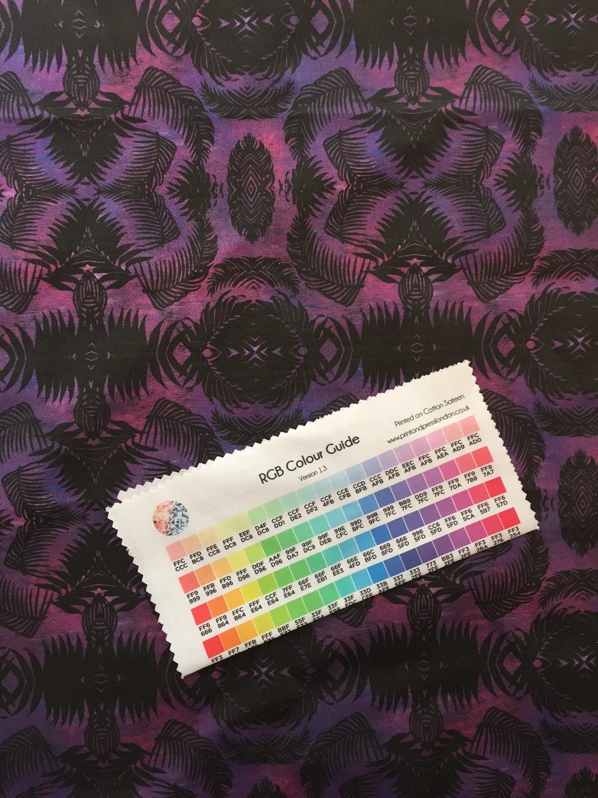
An example of a colour standard printed on fabric, from Print and Press London
What should I look for on the lab dip?
When you receive your lab dip, take a close look at it and compare it to your colour standard. Keep in mind that lab dips are usually TINY, around 2cm x 2cm (less than 1 inch). You might be lucky enough to get a bigger sample, but usually they are super small, so you will have to look extremely closely.
This probably sounds strange, but look at the lab dip in different lights, in different angles, even hold it up against yourself and look at it in the mirror. In industry, we look at these in a 'light box', which control the 'type' of light being used. While these are helpful for lab dips, they're also very expensive and personally I don't feel they're worth the investment as a small brand. These are the things I always look out for and ask myself when assessing the lab dip;
Do I like the colours and if I've given a fabric reference, do they match? I do find in the industry, we can be over critical of colours and expect the closest match possible (myself included!). The most important thing to keep in mind is, if this colour is different, will it affect anything else in the range. If you've got plain fabrics, trims and accessories all matching the same colour, it's really important to ensure that the colour is a perfect match. Otherwise, when everything is sewn together, it can look 'off' and a bit cheap if the colours don't match well. However, if the colour is a one-off in the range, it can be good to take a step back and simply think, 'do I like this and will my customer like it'? If so and the colours are a bit out, it's perfectly acceptable to approve it in this instance.
Keep in mind that different fabrics dye differently, so you may notice colour variations across the same colour because of this. As with the point above, you want to think about what the lab dip is for and what the fabric will be used for. If there's 2 different fabrics, in the same colour on the same garment, you'll want to look at this closely. Do factor in things like a shiny fabric vs non-shiny. The way the light reflects off of a shiny fabric will always make the colour appear different, hence the importance of checking in different lights.
Is the quality as expected? The same colour can look great from one supplier, but awful from another, so it's always best to look at the details. Aside from the colour, the saturation is one of the most important things to check. The saturation is essentially how well the colour has taken to the fabric - is the application even, or is the base colour of the fabric showing through? The handfeel is also important to check, as some dyes can alter the feel or on some occasions, performance of the fabric.


How to give comments on a lab dip
First off, it's important to know that you don't have to accept the first lab dips the supplier sends (even if they send you multiple options the first time round). That said, do be aware of your timelines. There should always be enough time for multiple lab dips, but I know a lot of people (particularly, those new to the industry) tend to underestimate timings, so do double check that an extra set of lab dips won't affect your end delivery date. In terms of the comments themselves;
First off, if the factory gave you several options, choose the one that's closest to your colour standard
Depending on the type of supplier you're working with, you might be able to get away with a generic comment like 'Option A is best, but this is too dark, please revise' BUT....
Many factories will require (they might not ask for it, but you'll find you'll get better results from them) specific details. For instance 'Option A is best, but it's too dark and needs to have less black in it. The tone is also a little too yellow, so please reduce the amount of yellow'.
The factory might agree to make the changes on the bulk order. DO NOT accept this! You must see a revised lab dip to approve, before the bulk fabric is dyed, so make sure you ask to see one.
I hope this has helped you to understand what a lab dip is and why it's so important - don't commit to dying fabric without having seen a lab dip that you approve of!
If you're keen to learn more about the process of getting a garment into production, I have a free Masterclass available called ‘How to get Your Fashion Ideas Produced’ and you can click here to register free to watch.


A/W 2018/19 fashion trends; Historical Opulence
I love this trend for the Autumn/Winter 2018/19 season. Full of decadence, stunning details and lace designs, it’s sure to catch people’s attention…
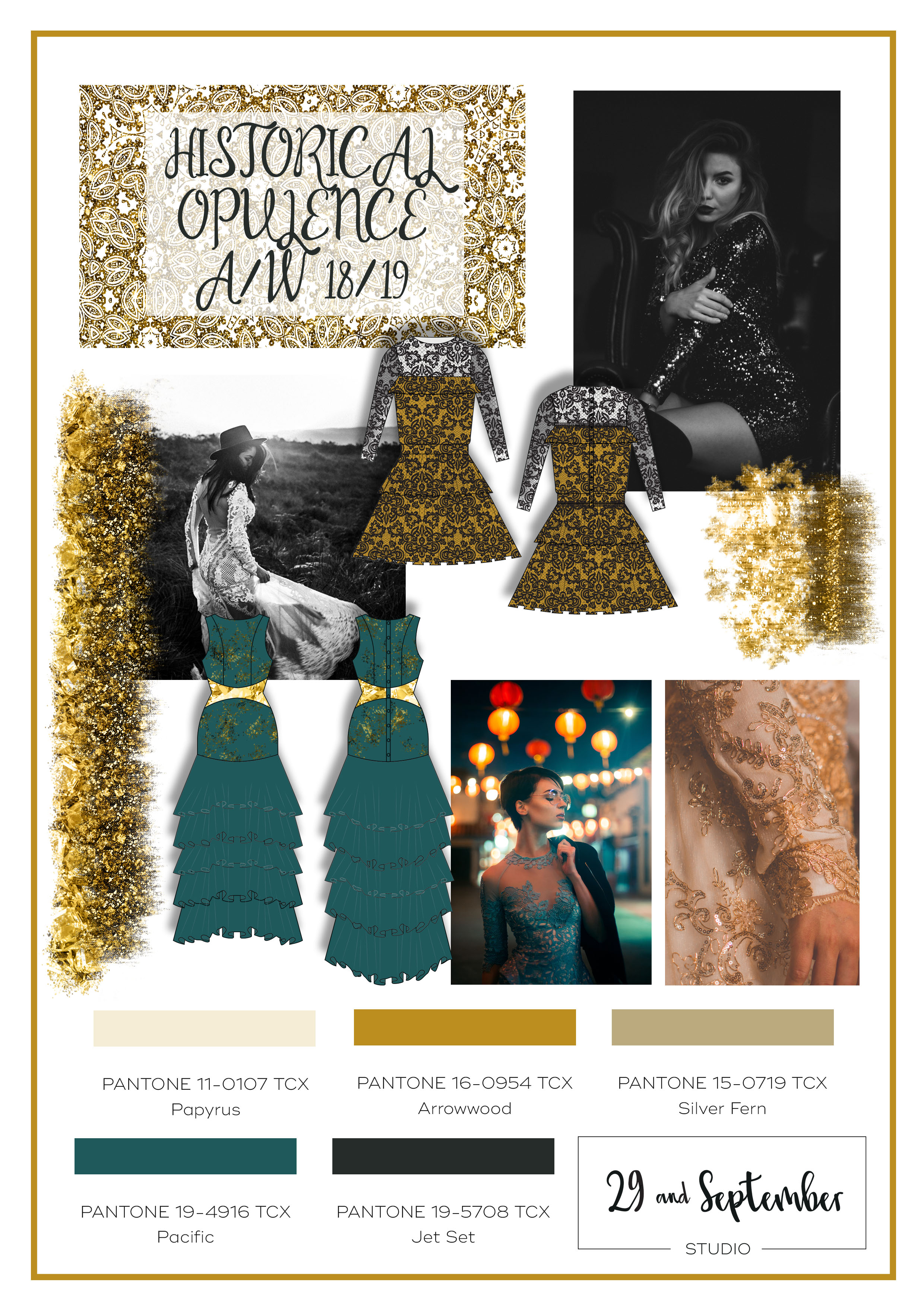
I feel like every time I create a trend board, I'm telling you it's my favourite (although, I guess I do always pick my favourite trends, out of the many that are available, so I suppose it makes sense!). But I really think this time it is my favourite!
I've called it 'Historical Opulence' and it's for Autumn/Winter 2018/19 (Fall/Winter for our friends across the Atlantic). The trend is inspired by Royalty of the past, who surrounded themselves in luxury. For this reason, there's a lot of gold tones and beading used as well as rich, luxurious fabrics and high quality finishing. It's perfect for a high end range, but, it can also be tailored to more affordable ranges too.
For instance, lace can be pricey, so I've developed prints which give the feel of lace, but can be applied as a normal print, so you don't have to worry about using lots of expensive, delicate lace. You can also give the effect of sheer layers, by printing the lace design on a colour from your collection and also onto a nude tone.
This same technique can also be applied to embroidery designs; if you can't afford to have intricate embroidery, you can look at the option of having this printed, to give the overall feel of luxury, but in a more cost effective way.

If your brand can't support expensive beading techniques, you could consider using foil printing, to give the feel of opulence and gold, without the price tag. For example I used this method, alongside a small panel of gold, shimmery fabric, to add interest to this design;


I hope you like this trend as much as I do! If you're wanting to use some of the techniques I mentioned for brining costs down and you're looking for print designs, I'd love to work with this and have limited spaces for working with clients 1-on-1. I also have a small selection of pre-designed prints, which you can view on request. If this is of interest, you can get in touch by clicking here.

I hate spam too - if you sign up to this email list, your details won't be sold or leased to anyone else. I will email you from time to time with helpful content and occasional offers, which you can unsubscribe from at any time.

S/S 2018 trends; Geometric Illusion
Looking for some inspiration for your next clothing or print range? In this post I talk about one of the key SS19 fashion trends....

By popular demand, this month I'm covering another SS18 activewear trend. Activewear is a huge area of growth and often a lot more fun to work with as you can experiment with bold and busy patterns, so it's no wonder so many of the startups I work with choose activewear! This trend creates an optical illusion from geometric inspiration. The geometry aspect comes from many sources, from modern glass buildings to insect wings, if it has interesting geometric shapes, it's in!
I've got to admit, I'm loving the colour scheme for this trend! Black, white and grey are typically bestsellers and I love the use of green in activewear, do you?
So far, I've made a start on one print. Stripes are always popular but I wanted to create something a bit out of the ordinary. I looked to geometric shapes in architecture to get the inspiration for the stripe layout. Then I looked to the softer references on the moodboard to colour the stripes in an unusual, abstract way.

There are a number of trends showing for activewear this summer and out of all of them I feel this one is most commercial, partly because of the colour palette but also because it's a familiar trend that people feel comfortable with. It's not cutting edge or completely new, more of a new interpretation on something that customers already know and love.
As a designer, it's exciting because there are so many different ways that you can take the design ideas - from busy overlapping shapes to simple stripe ideas, the options are huge!


I hope this post has given your some inspiration for your next range. This is the last trend for S/S18, next time on the blog, we're moving on to A/W 18/19 - how time flies! If you're still working on S/S18, (it's best to move fast as production will need to be happening very soon).

I hate spam too - if you sign up to this email list, your details won't be sold or leased to anyone else. I will email you from time to time with helpful content and occasional offers, which you can unsubscribe from at any time.
I hate spam too - if you sign up to this email list, your details won't be sold or leased to anyone else. I will email you from time to time with helpful content and occasional offers, which you can unsubscribe from at any time.
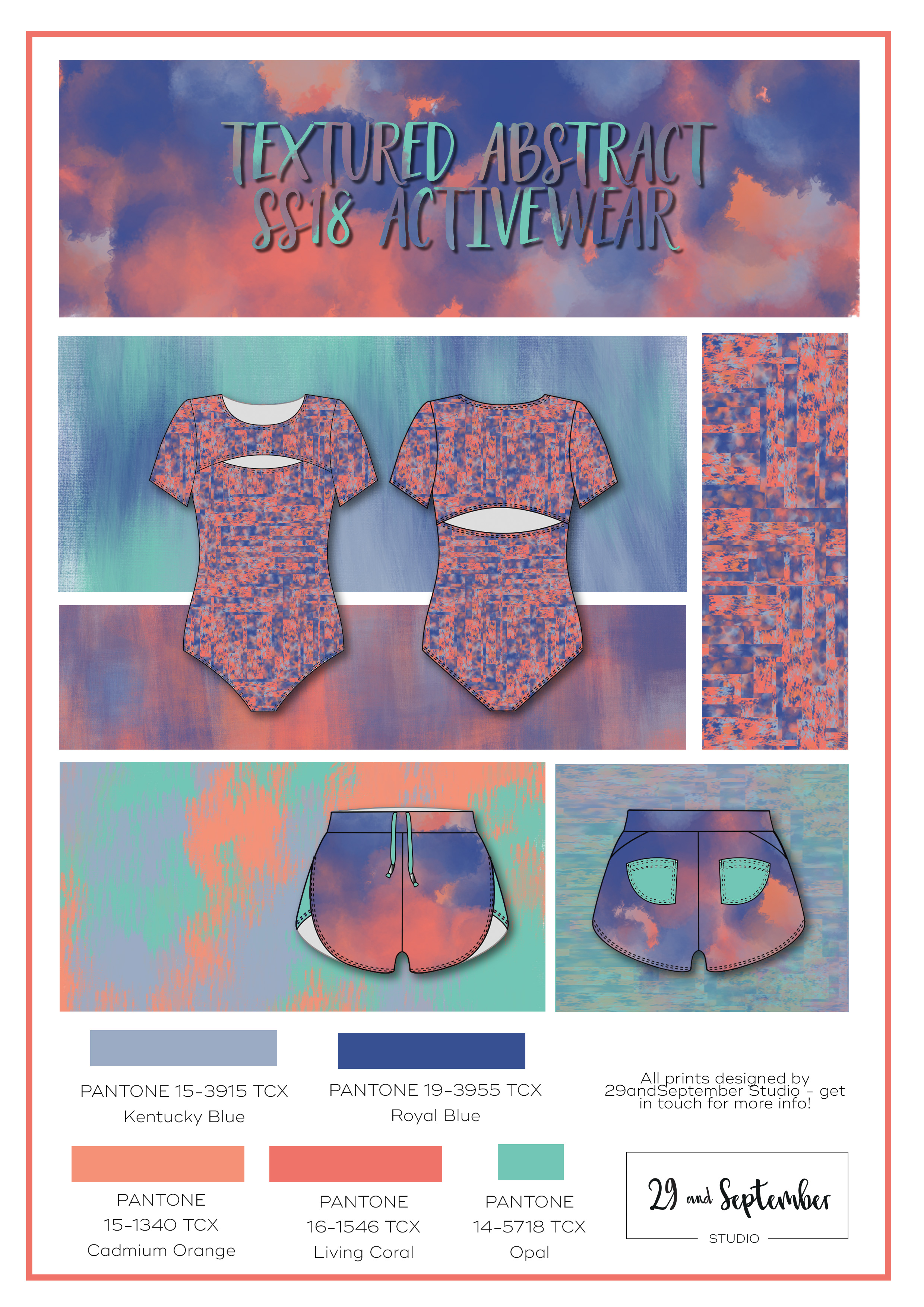
S/S 2018 trends; Textured abstract
Looking for some inspiration for your next activewear range? Then I have something for you.....
Trend information doesn't come cheap (and I mean seriously expensive, a WGSN membership is £10000 per YEAR!) and you may have noticed that there's very little free information available. Being trend aware can be really important for a fashion brand, as it helps you to keep you trend conscious customers happy and be relevant to the press. But, most of us can't afford £10,000 a year - I get it, so I thought I’d share some mood boards on the blog.
A while ago I posted some activewear designs and have been overwhelmed by the response (thanks, everyone!). It's clear that a lot of you are wanting to start an activewear label, which is great. It's a really exciting area to work in and if you love print, it's especially good as I find that you can be much more adventurous than you can with everyday wear. There's a number of activewear trends showing for SS18 and a personal favourite is the use of textures to create an abstract style. It's a little bit different from what we've seen in other seasons, as there's now an addition of watercolour style influences, which is a nice touch and gives a softer look than the fully digital styling.


I'm a huge fan of coral so I was excited to see this trending, along with the fresh green colour which I think compliments it well. Personally, I really like these colours on there own, but it is always good to include some of your bestselling colours in the range too, more often than not, black, grey and white. Of course, you could introduce one or two of these prints/colours into a monochrome range; this could be a way of being trend relevant, but still commercial.
As well as the activewear market, I also think this print could work really well for the swim market, I can picture this print design on a sporty, high neck bikini set.
If you're interested in having a print designed for your range you can get in touch here for more info about working together.

I hate spam too - if you sign up to this email list, your details won't be sold or leased to anyone else. I will email you from time to time with helpful content and occasional offers, which you can unsubscribe from at any time.
I hate spam too - if you sign up to this email list, your details won't be sold or leased to anyone else. I will email you from time to time with helpful content and occasional offers, which you can unsubscribe from at any time.

Print design trends; Paisley | How I created my Paisley print
A lot of work goes into creating an on-trend, commercial + high quality print. The Paisley trend looks set to continue for S/S2018 + this post goes behind the scenes to see how I created a paisley print....

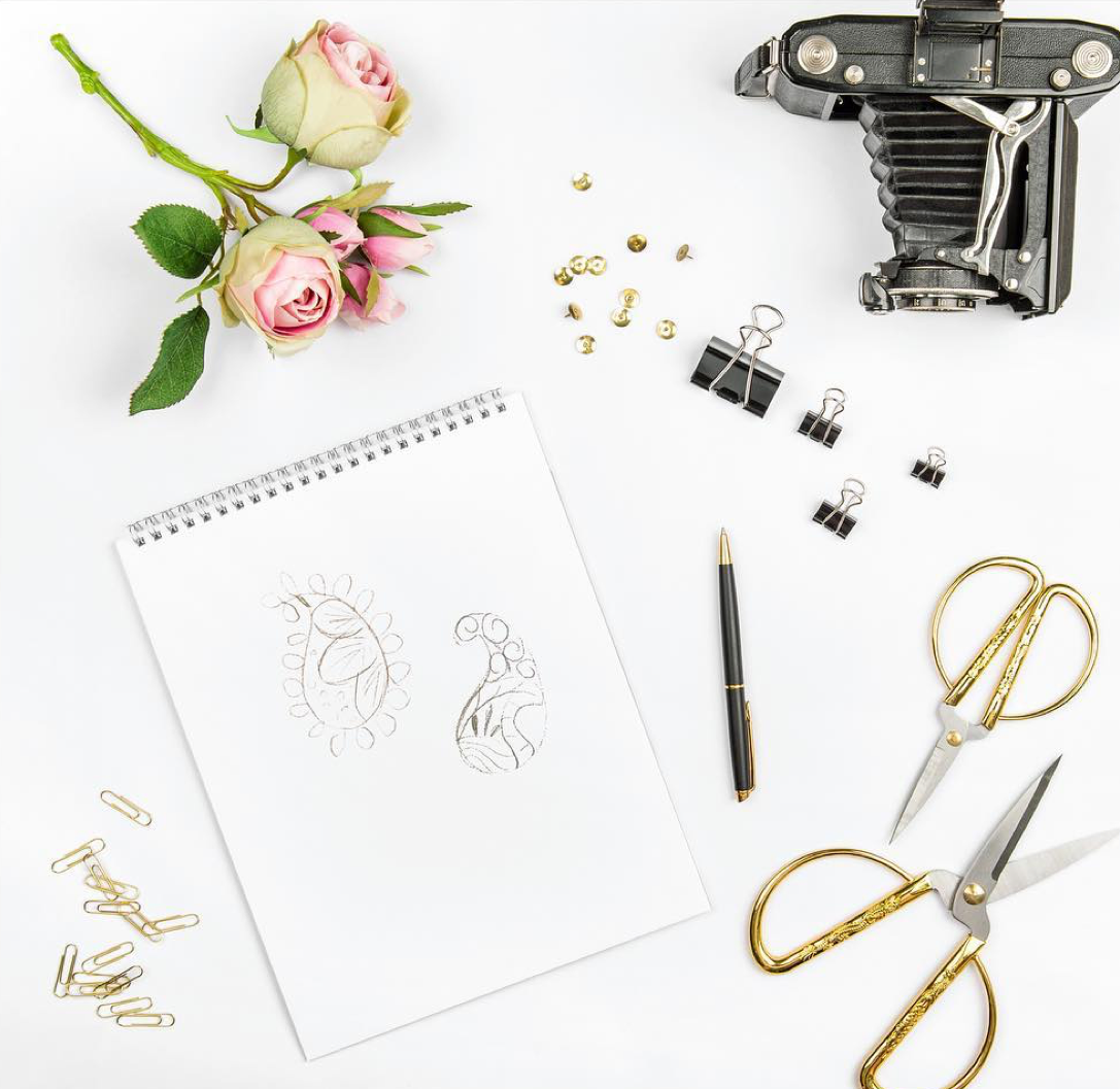
For me, designing a new print or range is a long process. I come from a design background where speed is key + repurposing old designs is the norm, but in reality, this isn't my style. I really missed working on original designs, which is one of the reasons why I started my own business.
For the most part, I always start with a hand drawing or painting. I definitely don’t have a natural flare for sketching, but I find it helpful to get some ideas down on paper that can be refined later. Depending on the design, there might be some painting, dying, or another messy technique involved (marbling is a personal fave!) - l love experimenting with colour + texture. For the paisley print, I was working with a simple colour scheme, so I just did some initial sketches.
The next stage is digitising the print, in this case I used Adobe Illustration to start. After scanning in my sketches, I start to fix some of the imperfections in my hand drawings - I don't fix them all though, because I love to show a bit of the handmade quality in the artwork. This is the part where I wish I wasn’t a perfectionist. Despite a decade of experience with illustrator, it’s easy to get caught up looking at every tiny detail zoomed in at 500% + spending hours on something that no-one will ever see!


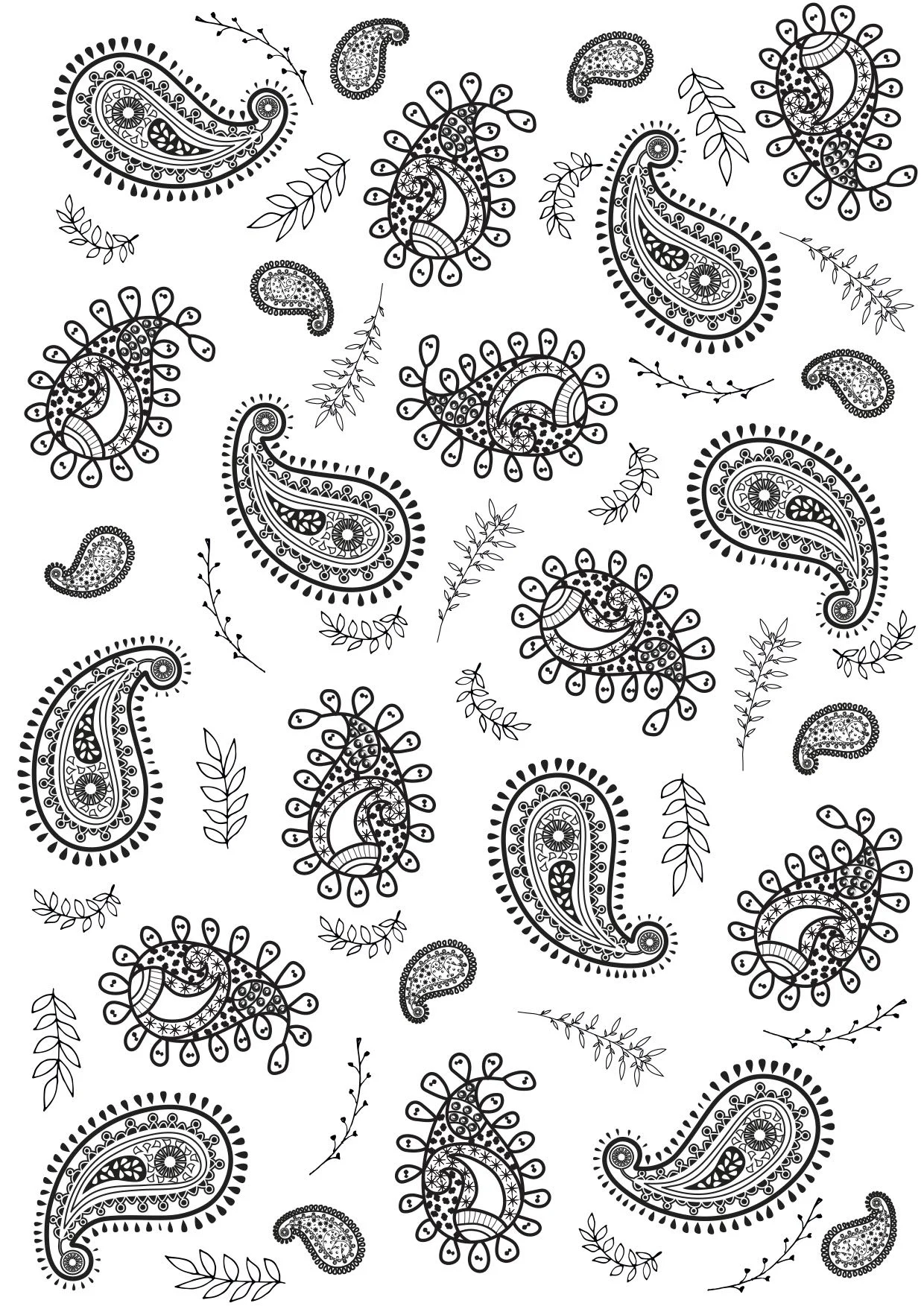
Once the shapes are complete, I start putting them into a repeat pattern. A repeat pattern means that you can basically print the design to infinity, without any lines or marks in the design - it lines up seamlessly. I think this is something that can take a lot of designers hours to work on and a lot seem to stick to ‘placement prints’ (where there’s no need to do a repeat). But, after years of practice and learning a few tricks, the repeat comes together naturally. I play around with lots of different options for colour, scale, layout + have fun putting the design together. In the end I never seem to be able to choose a favourite, so I generally offer a few options.
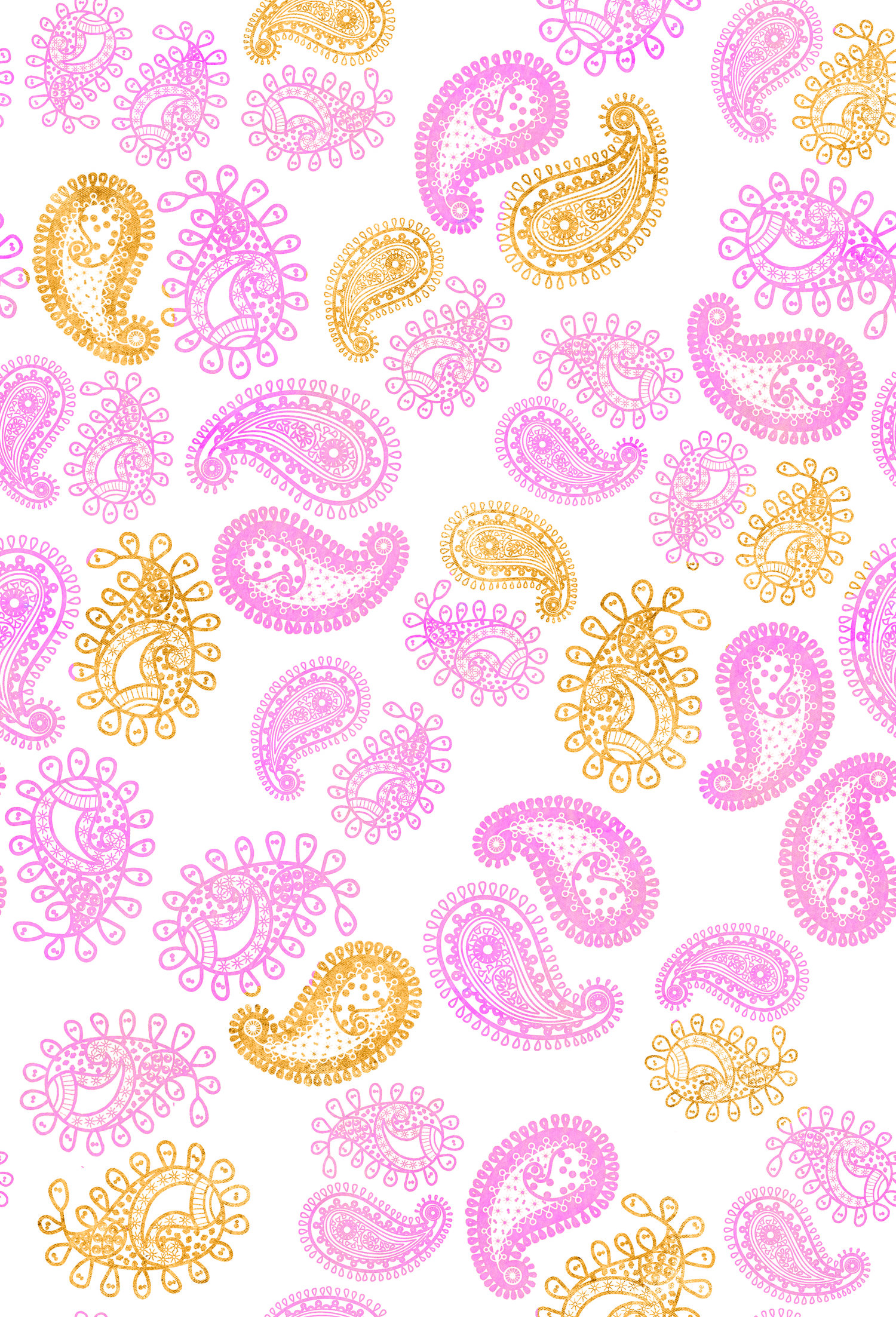


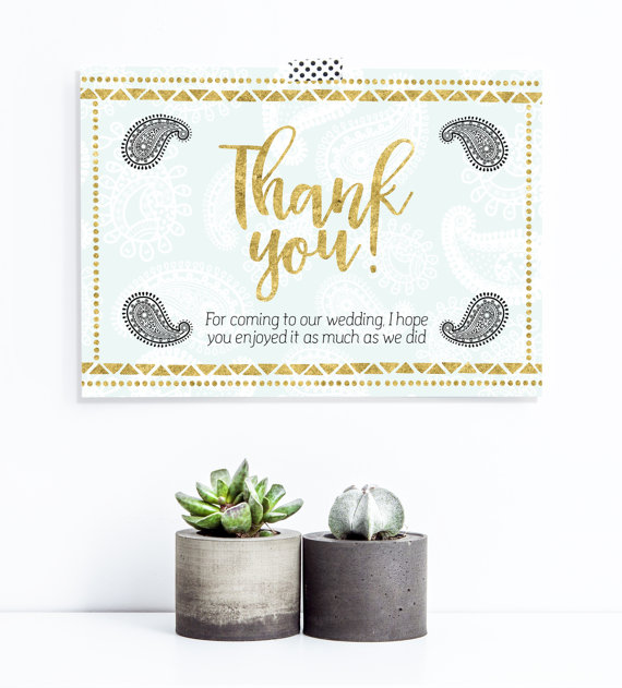
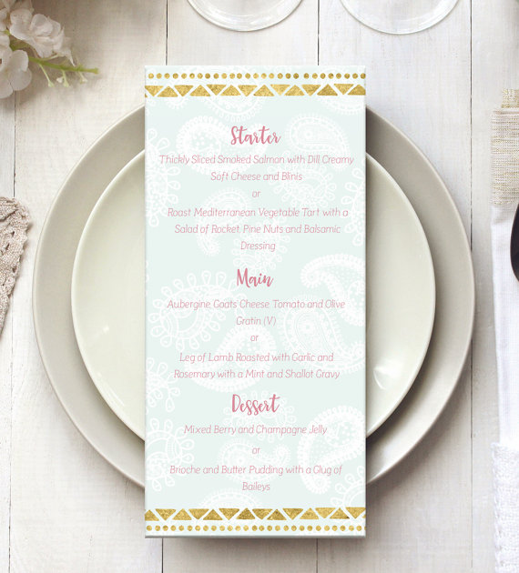
After some further changes to the colour + scale, the print was then ready to use. Although I'm a specalist in print for fabrics, I couldn't resist using this in a wedding stationary range, as it fitted the brief so well. Here's a few examples below of the print being used.
Want to learn more about working together on prints? Click here to get in touch.


Textile technology + how it applies to you
You might think that fabric technology doesn't apply to you, but actually 'technical textiles' can add great selling points to your designs. Here's why....

If you've been following along on social media, you may be aware that I went to a number of seminars recently, including several on textiles technology + sustainability. The best thing to come out of these seminars is the knowledge that 'technical textiles' are no longer just for big name brands + that smaller labels can buy into this as well. Not only are sustainable and/or organic textiles becoming more + more available, but also fabrics with special features or properties that add extra benifits + value for your customers are now in the marketplace. These are a great way to promote your product + give you a point of difference when trying to pitch your designs to bloggers + media outlets. So what are 'technical textiles' exactly?
A technical textile is a textile product that has been manufactured to give functionality, rather than being purely aesthetics based (that's not to say that they can't be nice to look at!). Some general examples would be things like;
Heat protective fabrics that are used for fire fighters uniforms
Medical uses such as implants
Car parts (did you know that textiles are used to make up the body of cars?)
Protective fabrics used for things like bullet proof vests + spacesuits
These are very specific properties used by various industries to solve a problem, or at least improve it. The fashion industry is very much about the visual aspect + there hasn't been much use of technical textiles, certainly not in the mainstream. But, there are a lot of properties that you can consider + you may have seen starting to pop up at other labels;
Stain resistant
Anti bacterial
Flame resistant
UV protection
Moisture wicking
These types of fabrics are known as 'Nano fabrics', which basically means that the fabric has been engineered with small particles that provide particular benefits. This is high tech development - for a fibre to be classes as a nano fibre it has to have a width of less than 1000 nanometers!


So, what can you do as a small business owner to take advantage of these developments in textiles technology? The good news is that you don't have to spend a fortunate developing your own fabrics. Fabric development is really pricey, so the better option is to work with manufacturers who are already creating fabric with these properties. What you're doing essentially is letting someone else pay for all of the development + you just buy the end product (the fabric) from them. Sure, this means that you'll be a little behind companies like Nike, because they will have the technology first, but as long as you keep up to date with what the textile mills are creating, there's no reason why you can't be ahead of your competitors. For example, you may know that I work with a lot of swimwear companies, many of whom do competitor research (as they should + so should everyone!). A lot of brands out there don't offer any special features in their fabric, which I find crazy! There's so many great swimwear fabrics out there that are open to small minimums. Think of how great it would be to tell your customers (+ the press) that your fabric offers UV protection, or it's recycled from old fishing nets that are harmful to wildlife, or it's fade resistant + won't be damaged by chlorine? How much perceived value do you think that would add for your customer? + the best part is, these fabrics aren't crazy expensive, as you probably thought they would be!
Let's look at some other examples, from the sustainability side. Did you know that currently fabrics are being made from;
Mushrooms
Orange peel (the leftovers from making orange juice)
Old fishing nets
Cow poop (yes, really!)
Milk
Soy
Sea kelp
Pre industrial waste
The exciting thing is that all of the above are either sustainable, or using recycled materials, which really minimises the environmental impact of apparel production + they are all available in the market place. They also have great performance + handful - you wouldn't recognise the source of the fibres at all! In fact, I have a lot of the swatches at the office + find many of them to be better than 'conventional' fabrics.
I hope this article has opened your mind up to the possibilities + opportunities created by advancements in technical textiles. More posts like this are planned, if you're interested to learn more you can sign up to the mailing list below to receive occasional updates on new posts + you'll also get access to my free resource library (full of free downloads to help your fashion business).
If you do sign up to this email list, your details won't be sold or leased to anyone else. I will email you from time to time with helpful content and occasional offers, which you can unsubscribe from at any time.
I always welcome suggestions for blog comments, so please feel free to reach out if there's a topic you'd like to see, or if there's something your struggling with + need some guidance on.
I hate spam too - if you sign up to this email list, your details won't be sold or leased to anyone else. I will email you from time to time with helpful content and occasional offers, which you can unsubscribe from at any time.

Why do colours appear different when fabric is printed or dyed?
It may sound simple but colour selection and management can be a complicated issue. Find out why in this post....

It can be really frustrating to have taken the time to carefully select colours for your range, only to find that when your samples come in, the colour looks different from how you imagined it. Most people think that dying or printing a fabric to match a colour is easy, but actually it can be very complicated + may take a couple of months to perfect the colour. Theres a few factors that contribute to customers being disappointed with colours that a factory or supplier have presented to them;
- Sometimes, the colour hasn't been communicated well enough. For example, people who are new to the industry may just ask the factory to dye the fabric 'blue', or 'black', or 'yellow' and so on, but there are hundreds of variations of these colours and this information is far too vague. Look at the 2 pictures below. The first shows a colour book (see how thick it is!) and the other is a search for 'Black' on the Pantone website, which generates over 100 results.
- The colour may have been approved on screen. Keep in mind that on-screen colour can look very different, depending on your monitor settings. As a quick example that you can do now to see the difference, change the brightness settings on your monitor. Even changing this 1 or 2 places makes a big difference to how the colour appears to you. But, in the system, the colour details (that you may have chosen to print from) remain unchanged.
- The colour may have been approved on a different fabric, or perhaps on a paper printout. Different fabrications absorb dyes differently + also the texture/transparency of the fabric has a part to play in how the colour appears as well. Just because you like the way the colours looked when you printed it out on paper doesn't mean that you'll be happy with how it looks on fabric. Something else to consider is that if the fabric is slightly transparent, essentially colours in the background will be mixing with the fabric to create a different colour. For instance, on a transparent sleeve, the colour will look slightly different on people with different skin tones.


So, what can you do about it? There's a few things that you can do to have more control over the colour of the finished print. In general (as with much of the production process), a lot of the success comes down to communication + making sure that you + your factory are on the same page;
- Testing the colour is always a must, I would never confirm a fabric order without having seen a test. For dyed fabrics you can request 'lab dips' from the factory. These are small samples of fabric that has been dyed following your request, often they will send several options + you can choose the best one. Don't be afraid to reject the samples if you're not happy with the colour, but remember to give the factory detailed information on what you did/didn't like + what needs to change so they can improve it for you. For printed fabrics, you can request a 'strike off', this is a test print of fabric. There's a full post about strike off's that you can read by clicking here. Ensure that any tests are done on the correct fabric that you will be using on the final garment to ensure the best results.
- Give the factory a 'colour standard' to dye/print from. Different companies use different references for colour standards, but essentially this is a colour that the client gives the factory to print from. The colour is named + the factory know that (because you have briefed them well) every item with that colour name should be dyed to match (also written as DTM) the colour standard. You could give the colour standard as a swatch of fabric, digital colour code or Pantone reference;
- Swatch of fabric - this method is often used in industry, but do keep in mind as mentioned above that different fabrics do dye + can appear differently. If you use a piece of fabric make sure it's a single colour fabric (i.e. the threads are all one colour) + try to avoid using anything with lots of texture or grain as this will make it harder for you to match + compare the colour.
- Pantone - the Pantone reference system is an internationally recognised colour matching system. They sell various products, such as colour books (even ones with cotton swatches, ideal for the fashion industry) + most large companies + factories that you come across will also have a Pantone book. This makes things easier as Pantone is so widely recognised + also saves time as you don't have to send a sample to the factory, you can just email the number to them. Pantone numbers also have digital colour codes that can be used in the creation of digital artwork. In my opinion (+ the opinion of lots of others too!) Pantone's are the easiest way to work, but it comes with a price tag - an entry level fabric Pantone book is around $600US (approx £465).
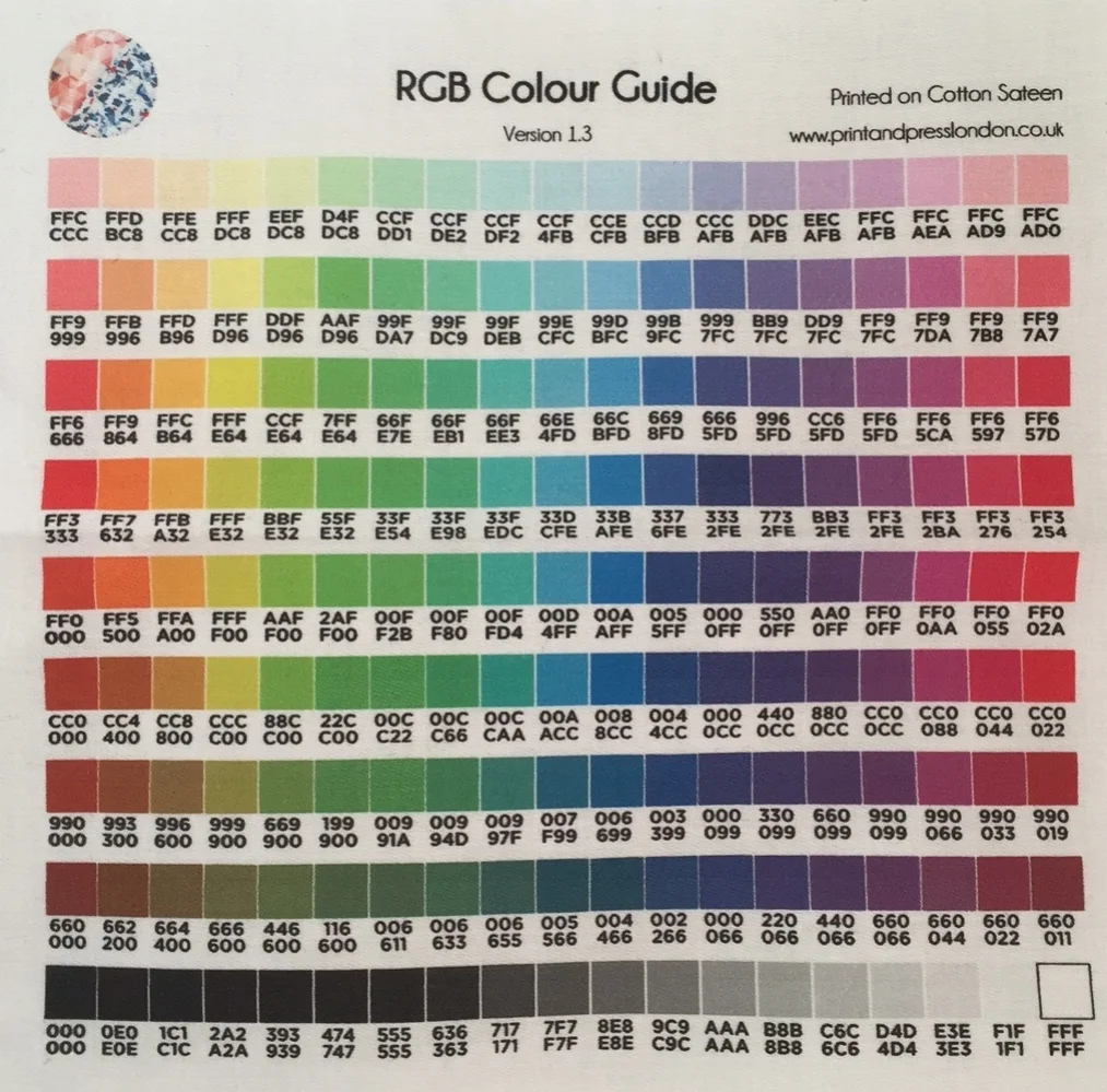
- Digital colour codes can often be found in print artwork + some printers will give you a reference guide, printed onto fabric, that you can work with to get an idea of what the print will turn out like. You can see an example of one of those below from Print & Press London.
I hope this post has given you some insight into the complicated process of colour matching! You may wonder why this matters, but it can actually effect sales. I used to work for a big company who sent out lookbooks to all of their customers, over 1 million of them. In the lookbook, all of the colours looked as though they matched perfectly, so people would by outfits to match. However, as the colour didn't match they would return the items to us. Not only had we lost a sale, but we also had to absorb the cost of the postage (in the UK if someone returns an item within 7 days you have to refund the postage) + also the cost the packaging + paying staff to return this to stock. So it does pay to get the colours matching! As always, if you have any questions feel free to pop them in the comments below, or message me directly here.
I hate spam too - if you sign up to this email list, your details won't be sold or leased to anyone else. I will email you from time to time with helpful content and occasional offers, which you can unsubscribe from at any time.

5 tips for selling print designs to buyers - feature on Print + Press London
I'm thrilled to be featured on the Print & Press blog this month! I've been talking Beki at Print & Press about successfully selling your print designs to a buyer...

I'm delighted to have been featured on the Print & Press blog this week! If you're not familiar with Print & Press, they offer digital printing services perfect for small businesses + they also run a blog with tons of helpful content on printing, selling your products + creative ideas. I've been featured on the website, as I'm sharing my best tips for print designers to get noticed by print buyers. I've been on both ends of the spectrum, a print buyer + a print designer + in the post I'll be exploring what print buyers are looking for. You can read the full post on the Print & Press blog, by clicking here. There's even a free checklist I've created to help you prepare for your next pitch!
I'd love to hear your thoughts on this, or any ideas you have for future blog posts. Feel free to leave a comment below, or send me a message here.


I hate spam too - if you sign up to this email list, your details won't be sold or leased to anyone else. I will email you from time to time with helpful content and occasional offers, which you can unsubscribe from at any time.

What is a Strike Off and Why is it Important for Designs Using Prints?
If you're working with print designs it's really important to get a 'strike off' made. This post explores what a strike off is + what you should know about it...
So, first and foremost, what is a 'strike off'? A strike off is a sample of fabric that has been printed to your requirements, so that you can check to see if you're happy with it before agreeing for the full order to be printed. I would never arrange for a large order of fabric to be printed without seeing a strike off first and encourage you to do the same. As well as picking up potential problems, there's other things that you might notice on a fabric printout, that you wouldn't see on screen. I always encourage people to print a paper version as well, but seeing the design on the correct fabric and in the correct colours is really important.
Don’t forget that strike offs are a small part of the fashion production process! If you’re looking for an in depth step-by-step guide to manufacturing a fashion product from scratch, click here to check out The Fashion Startup Online Course.
What do I need to ask for?
Suppliers will vary in exactly what they give you and will often provide you with something that is most convenient for them. I like to request the following on all of my strike offs, as this gives me the closest representation to the real thing and therefore the most informed choice on whether I want to proceed with the design or not;
Use the correct fabric, i.e. the actual fabric I will use for the bulk order - there's no point getting a strike off if it's in a totally different fabric. For one, different fabrics dye differently, so if you see a sample in cotton and the real thing is polyester, chances are the colours will look different. Also, the weave or knit of a fabric can play a part in whether or not a print is suitable. For example, if a fabric is printed on a smooth fabric for the strike off, but the final fabric is a cotton drill (which has noticeable grain and texture), the print might not look as nice. Also consider if your final fabric is sheer or semi-transparent and how this will affect the colour
Provide a sample bigger than the actual repeat. There's 2 kinds of prints; placement prints, where the print is on a specific part of the clothing, for example a slogan print on a t-shirt and a repeat print, where the fabric is printed all over and the print lines up seamlessly. If you've got a placement print, you should ensure you receive an example of the full print. For a repeat print, you want a sample bigger than the repeat. This is so you can view the whole print design and check to see if you like it, but also so you can check that the repeat lines up seamlessly and looks nice.
If you have any specific colour references, make sure you let the factory know before you have the strike off printed. The way colour is communicated varies between companies, factories and printers and there's several different ways of doing things that all work well, so it's up to you to outline how you want to work. Click here to learn more about this. The printing type also plays a part in this too. For example, if a print is being screen printed, inks are usually mixed 'by hand' and therefore a colour standard or Pantone reference number is used. For a digital print, many companies often just use the digital print file to print the colours from, as there's often hundreds of colours in the print, which would take too long to assign a colour standard to. If there's a predominant colour that ties in with other items in your range, you may wish to provide a colour standard or Pantone reference for this.
Here's an example of a strike off I ordered and colour guide. Some printing companies will give you a colour guide printed on to their most popular fabrics, or you may be able to request this on the fabric you would like to use.
------------ ⭐️ Want support with your fashion brand? ⭐️ ------------
-------------------------------------------------------------------------------
What should I look for on the strike off?
When you receive your strike off, take a close look at it and ideally compare it with a paper printout and also any colour standards if you've used them. This probably sounds strange, but look at it in different lights, in different angles, even hold it up against yourself and look at it in the mirror. These are the things I always look out for when assessing the strike off;
Is the scale correct? There are some print methods which only allow repeats of a certain size to be used, for example rotary printing. I've had experiences where the factory hasn't told me that they don't have the correct size equipment, so they just scaled the print up without telling me. The print came in and was huge and didn't look right at all, so it's always worth checking the scale, just in case
Do I like the colours and if I've given a fabric reference, do they match? The most important thing to keep in mind is, if this colour is different, will it affect anything else in the range? If you've got plain fabrics, trims and accessories all matching the same colour, it's really important to ensure that the colour is a perfect match. Otherwise, when everything is sewn together, it can look 'off' and a bit cheap if the colours don't match well.
Does the print work with this fabric? Sometimes you'll find that a fabric just isn't doing the print any favours, or vice versa. For example, you might have seen me working on the print below. On screen I was really happy with it and printed on a smooth fabric, I thought it looked great, perfect for a swimwear range as it suited swim fabrics and also chiffons for cover ups. I also wanted to try the idea of a cotton drill beach bag, so I ordered a strike off. I've put a close up photo below, so you can see what I'm talking about. As you can see on the left, the grain of the fabric is causing visible lines in the print and some of the horizontal lines even look white. However the original doesn't have any such lines, as you can see on the right image. From this strike off, I can see that this type of print and this fabric aren't really what I was looking for and I won't have any further prints done on this fabric. This is exactly why we have a strike off - much better that I tried it on a small amount and realised I didn't like it, rather than spent money on the full order!
Is the quality as expected? The same type of print can look great from one supplier, but awful from another, so it's always best to look at the details. Check things like the colour saturation (how well the colour has taken to the fabric - is the application even, or is the base colour of the fabric showing through?), the definition (are details getting lost?) and the handfeel (is the ink causing the fabric to feel stiff?).

I hope this has helped you to understand what a strike off is and why it's so important - don't commit to a print order without having seen a strike off that you approve of!
💌 Love this kind of no-fluff, high-value advice?
Then you’ll definitely want in on my weekly newsletter - Designer Diaries. It’s your behind-the-scenes pass to growing a fashion brand without the overwhelm. Think bite-sized strategy, creative inspo, and the kind of real talk your business actually needs.
👇 Sign up below to get it straight to your inbox every week….

This Womenswear trend is inspired by the Wild West, but levelled up to a high end finish….