
Why do colours appear different when fabric is printed or dyed?

It can be really frustrating to have taken the time to carefully select colours for your range, only to find that when your samples come in, the colour looks different from how you imagined it. Most people think that dying or printing a fabric to match a colour is easy, but actually it can be very complicated + may take a couple of months to perfect the colour. Theres a few factors that contribute to customers being disappointed with colours that a factory or supplier have presented to them;
- Sometimes, the colour hasn't been communicated well enough. For example, people who are new to the industry may just ask the factory to dye the fabric 'blue', or 'black', or 'yellow' and so on, but there are hundreds of variations of these colours and this information is far too vague. Look at the 2 pictures below. The first shows a colour book (see how thick it is!) and the other is a search for 'Black' on the Pantone website, which generates over 100 results.
- The colour may have been approved on screen. Keep in mind that on-screen colour can look very different, depending on your monitor settings. As a quick example that you can do now to see the difference, change the brightness settings on your monitor. Even changing this 1 or 2 places makes a big difference to how the colour appears to you. But, in the system, the colour details (that you may have chosen to print from) remain unchanged.
- The colour may have been approved on a different fabric, or perhaps on a paper printout. Different fabrications absorb dyes differently + also the texture/transparency of the fabric has a part to play in how the colour appears as well. Just because you like the way the colours looked when you printed it out on paper doesn't mean that you'll be happy with how it looks on fabric. Something else to consider is that if the fabric is slightly transparent, essentially colours in the background will be mixing with the fabric to create a different colour. For instance, on a transparent sleeve, the colour will look slightly different on people with different skin tones.


So, what can you do about it? There's a few things that you can do to have more control over the colour of the finished print. In general (as with much of the production process), a lot of the success comes down to communication + making sure that you + your factory are on the same page;
- Testing the colour is always a must, I would never confirm a fabric order without having seen a test. For dyed fabrics you can request 'lab dips' from the factory. These are small samples of fabric that has been dyed following your request, often they will send several options + you can choose the best one. Don't be afraid to reject the samples if you're not happy with the colour, but remember to give the factory detailed information on what you did/didn't like + what needs to change so they can improve it for you. For printed fabrics, you can request a 'strike off', this is a test print of fabric. There's a full post about strike off's that you can read by clicking here. Ensure that any tests are done on the correct fabric that you will be using on the final garment to ensure the best results.
- Give the factory a 'colour standard' to dye/print from. Different companies use different references for colour standards, but essentially this is a colour that the client gives the factory to print from. The colour is named + the factory know that (because you have briefed them well) every item with that colour name should be dyed to match (also written as DTM) the colour standard. You could give the colour standard as a swatch of fabric, digital colour code or Pantone reference;
- Swatch of fabric - this method is often used in industry, but do keep in mind as mentioned above that different fabrics do dye + can appear differently. If you use a piece of fabric make sure it's a single colour fabric (i.e. the threads are all one colour) + try to avoid using anything with lots of texture or grain as this will make it harder for you to match + compare the colour.
- Pantone - the Pantone reference system is an internationally recognised colour matching system. They sell various products, such as colour books (even ones with cotton swatches, ideal for the fashion industry) + most large companies + factories that you come across will also have a Pantone book. This makes things easier as Pantone is so widely recognised + also saves time as you don't have to send a sample to the factory, you can just email the number to them. Pantone numbers also have digital colour codes that can be used in the creation of digital artwork. In my opinion (+ the opinion of lots of others too!) Pantone's are the easiest way to work, but it comes with a price tag - an entry level fabric Pantone book is around $600US (approx £465).
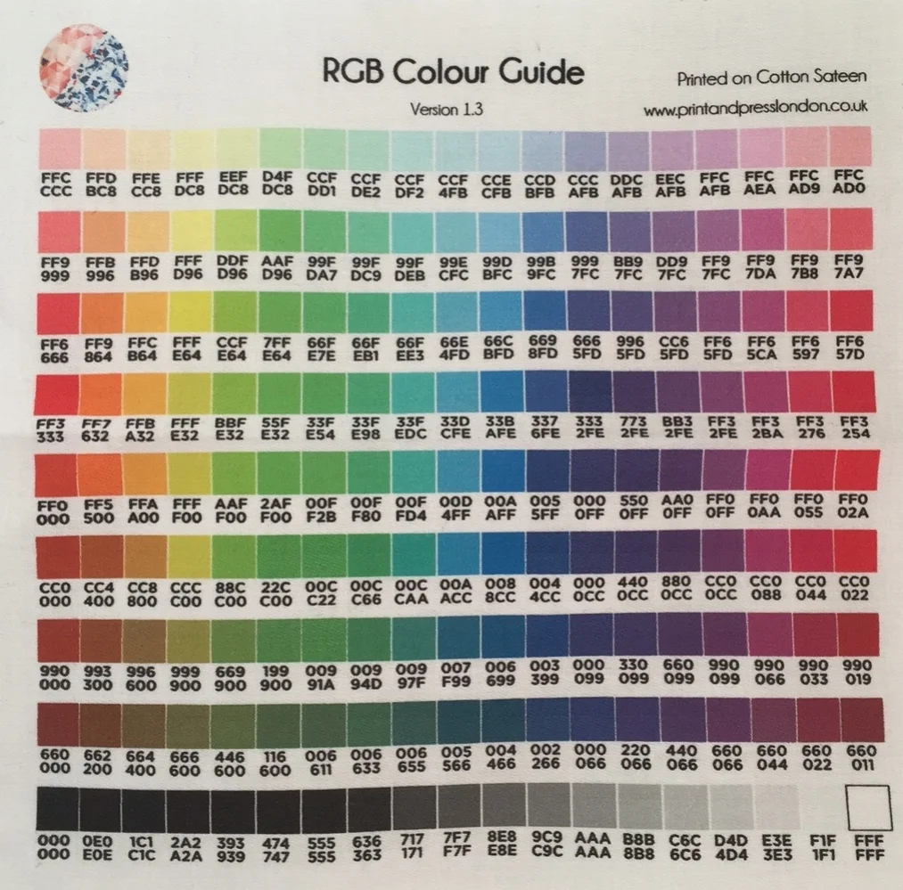
- Digital colour codes can often be found in print artwork + some printers will give you a reference guide, printed onto fabric, that you can work with to get an idea of what the print will turn out like. You can see an example of one of those below from Print & Press London.
I hope this post has given you some insight into the complicated process of colour matching! You may wonder why this matters, but it can actually effect sales. I used to work for a big company who sent out lookbooks to all of their customers, over 1 million of them. In the lookbook, all of the colours looked as though they matched perfectly, so people would by outfits to match. However, as the colour didn't match they would return the items to us. Not only had we lost a sale, but we also had to absorb the cost of the postage (in the UK if someone returns an item within 7 days you have to refund the postage) + also the cost the packaging + paying staff to return this to stock. So it does pay to get the colours matching! As always, if you have any questions feel free to pop them in the comments below, or message me directly here.
I hate spam too - if you sign up to this email list, your details won't be sold or leased to anyone else. I will email you from time to time with helpful content and occasional offers, which you can unsubscribe from at any time.


If you’re wanting to start a fashion brand in 2024, make sure you read this first!