
What is a Strike Off and Why is it Important for Designs Using Prints?
So, first and foremost, what is a 'strike off'? A strike off is a sample of fabric that has been printed to your requirements, so that you can check to see if you're happy with it before agreeing for the full order to be printed. I would never arrange for a large order of fabric to be printed without seeing a strike off first and encourage you to do the same. As well as picking up potential problems, there's other things that you might notice on a fabric printout, that you wouldn't see on screen. I always encourage people to print a paper version as well, but seeing the design on the correct fabric and in the correct colours is really important.
Don’t forget that strike offs are a small part of the fashion production process! If you’re looking for an in depth step-by-step guide to manufacturing a fashion product from scratch, click here to check out The Fashion Startup Online Course.
What do I need to ask for?
Suppliers will vary in exactly what they give you and will often provide you with something that is most convenient for them. I like to request the following on all of my strike offs, as this gives me the closest representation to the real thing and therefore the most informed choice on whether I want to proceed with the design or not;
Use the correct fabric, i.e. the actual fabric I will use for the bulk order - there's no point getting a strike off if it's in a totally different fabric. For one, different fabrics dye differently, so if you see a sample in cotton and the real thing is polyester, chances are the colours will look different. Also, the weave or knit of a fabric can play a part in whether or not a print is suitable. For example, if a fabric is printed on a smooth fabric for the strike off, but the final fabric is a cotton drill (which has noticeable grain and texture), the print might not look as nice. Also consider if your final fabric is sheer or semi-transparent and how this will affect the colour
Provide a sample bigger than the actual repeat. There's 2 kinds of prints; placement prints, where the print is on a specific part of the clothing, for example a slogan print on a t-shirt and a repeat print, where the fabric is printed all over and the print lines up seamlessly. If you've got a placement print, you should ensure you receive an example of the full print. For a repeat print, you want a sample bigger than the repeat. This is so you can view the whole print design and check to see if you like it, but also so you can check that the repeat lines up seamlessly and looks nice.
If you have any specific colour references, make sure you let the factory know before you have the strike off printed. The way colour is communicated varies between companies, factories and printers and there's several different ways of doing things that all work well, so it's up to you to outline how you want to work. Click here to learn more about this. The printing type also plays a part in this too. For example, if a print is being screen printed, inks are usually mixed 'by hand' and therefore a colour standard or Pantone reference number is used. For a digital print, many companies often just use the digital print file to print the colours from, as there's often hundreds of colours in the print, which would take too long to assign a colour standard to. If there's a predominant colour that ties in with other items in your range, you may wish to provide a colour standard or Pantone reference for this.
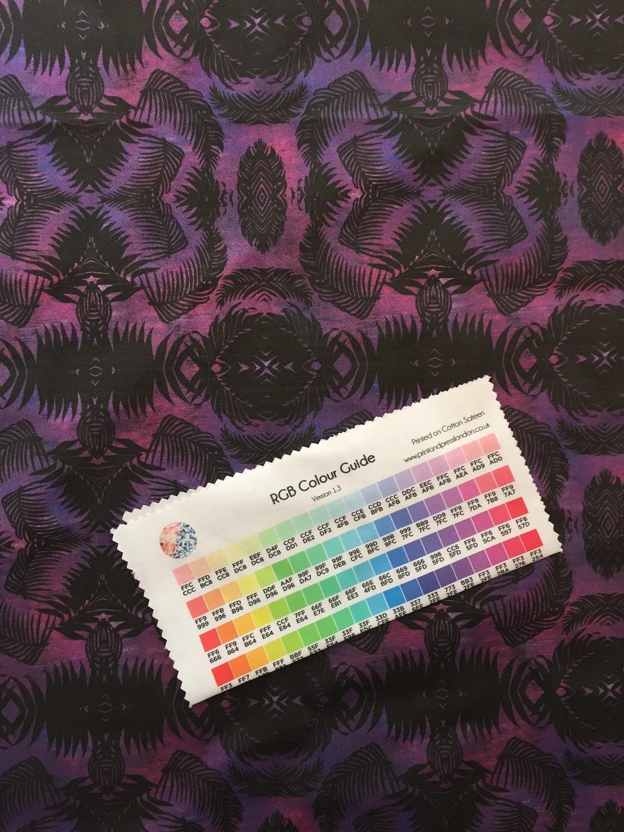
Here's an example of a strike off I ordered and colour guide. Some printing companies will give you a colour guide printed on to their most popular fabrics, or you may be able to request this on the fabric you would like to use.
------------ ⭐️ Want support with your fashion brand? ⭐️ ------------
-------------------------------------------------------------------------------
What should I look for on the strike off?
When you receive your strike off, take a close look at it and ideally compare it with a paper printout and also any colour standards if you've used them. This probably sounds strange, but look at it in different lights, in different angles, even hold it up against yourself and look at it in the mirror. These are the things I always look out for when assessing the strike off;
Is the scale correct? There are some print methods which only allow repeats of a certain size to be used, for example rotary printing. I've had experiences where the factory hasn't told me that they don't have the correct size equipment, so they just scaled the print up without telling me. The print came in and was huge and didn't look right at all, so it's always worth checking the scale, just in case
Do I like the colours and if I've given a fabric reference, do they match? The most important thing to keep in mind is, if this colour is different, will it affect anything else in the range? If you've got plain fabrics, trims and accessories all matching the same colour, it's really important to ensure that the colour is a perfect match. Otherwise, when everything is sewn together, it can look 'off' and a bit cheap if the colours don't match well.
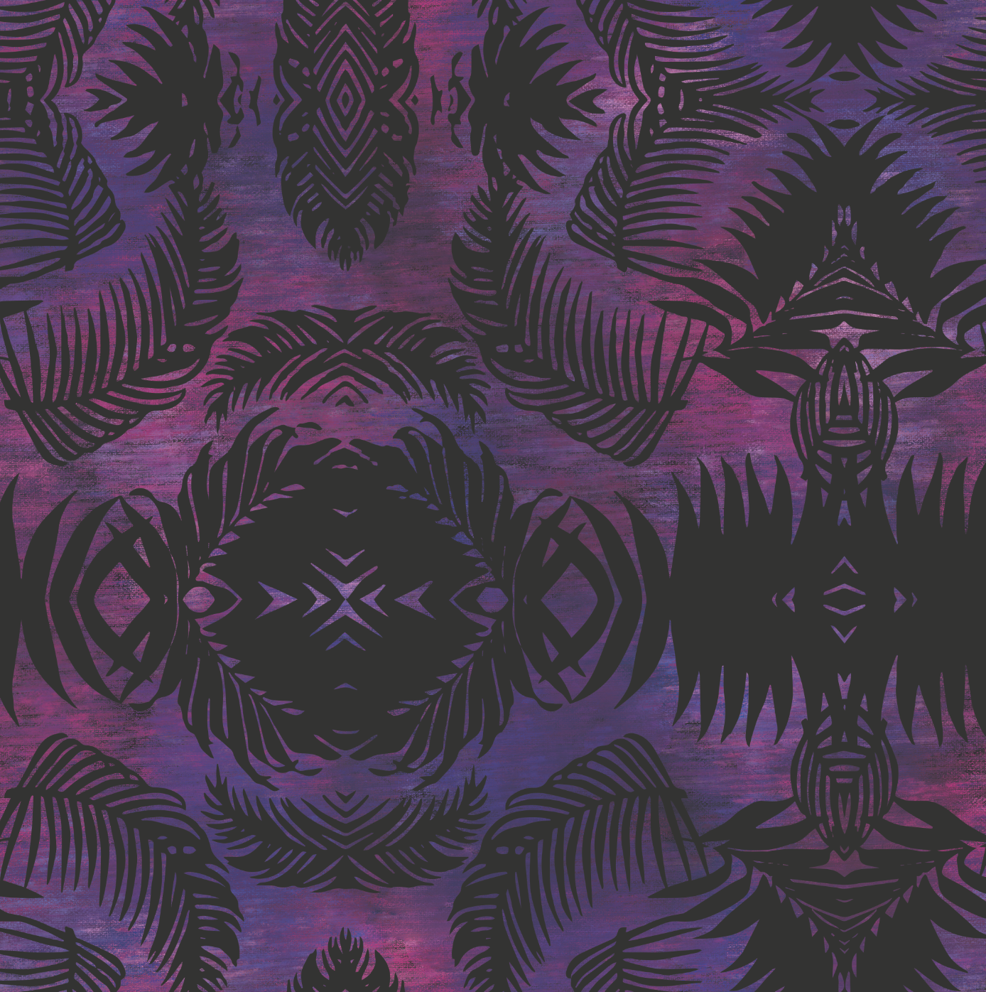
Does the print work with this fabric? Sometimes you'll find that a fabric just isn't doing the print any favours, or vice versa. For example, you might have seen me working on the print below. On screen I was really happy with it and printed on a smooth fabric, I thought it looked great, perfect for a swimwear range as it suited swim fabrics and also chiffons for cover ups. I also wanted to try the idea of a cotton drill beach bag, so I ordered a strike off. I've put a close up photo below, so you can see what I'm talking about. As you can see on the left, the grain of the fabric is causing visible lines in the print and some of the horizontal lines even look white. However the original doesn't have any such lines, as you can see on the right image. From this strike off, I can see that this type of print and this fabric aren't really what I was looking for and I won't have any further prints done on this fabric. This is exactly why we have a strike off - much better that I tried it on a small amount and realised I didn't like it, rather than spent money on the full order!
Is the quality as expected? The same type of print can look great from one supplier, but awful from another, so it's always best to look at the details. Check things like the colour saturation (how well the colour has taken to the fabric - is the application even, or is the base colour of the fabric showing through?), the definition (are details getting lost?) and the handfeel (is the ink causing the fabric to feel stiff?).

I hope this has helped you to understand what a strike off is and why it's so important - don't commit to a print order without having seen a strike off that you approve of!
💌 Love this kind of no-fluff, high-value advice?
Then you’ll definitely want in on my weekly newsletter - Designer Diaries. It’s your behind-the-scenes pass to growing a fashion brand without the overwhelm. Think bite-sized strategy, creative inspo, and the kind of real talk your business actually needs.
👇 Sign up below to get it straight to your inbox every week….


If you’re wanting to start a fashion brand in 2024, make sure you read this first!